Sweet moments,made modern
Era is a modern pastry shop. We built a minimalist identity for it — clean, light and memorable on packaging, in social media and on the street.
View more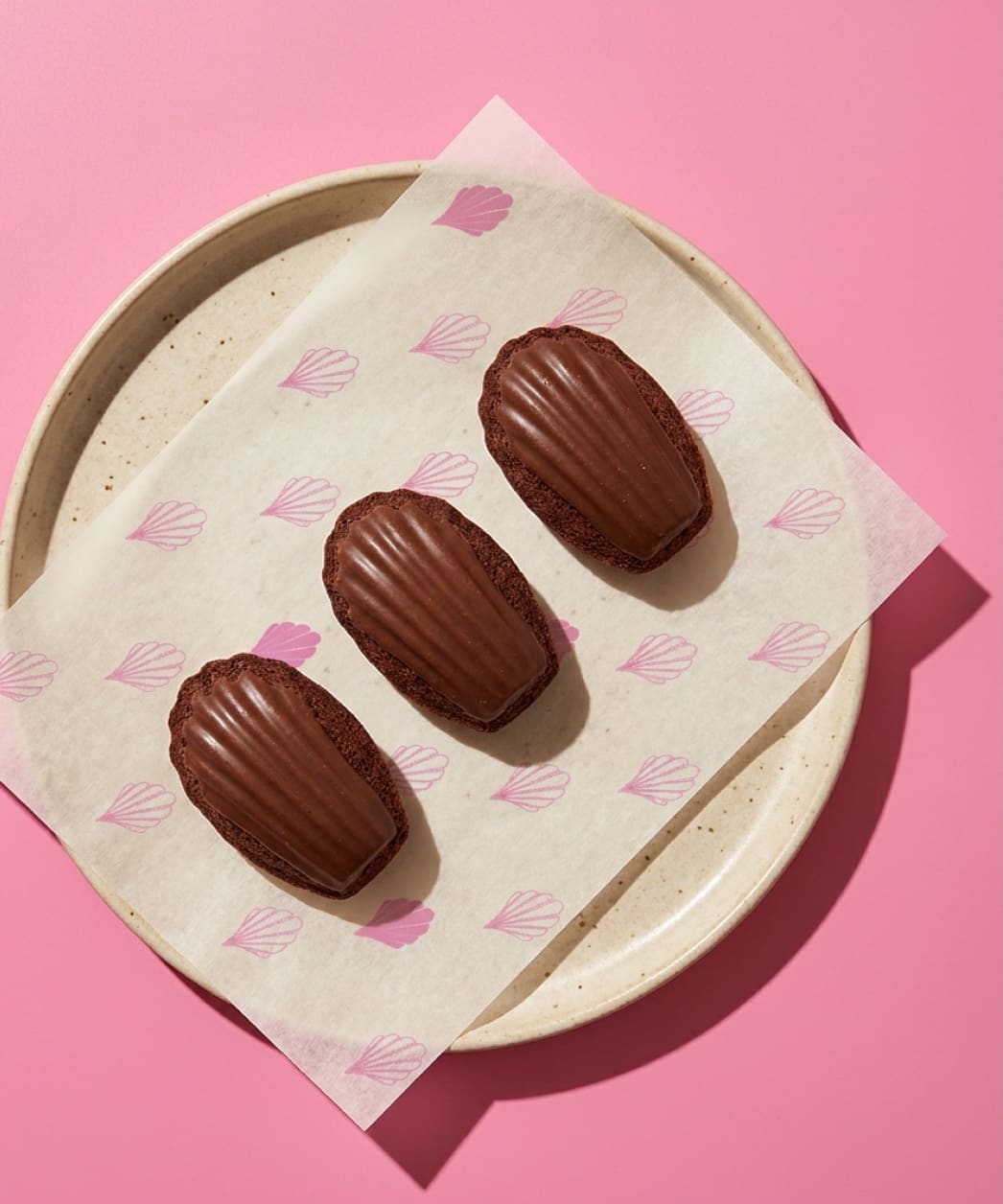
The taste of a madeleine
The brand symbol is a madeleine that also reads as an accent mark over the name Era.
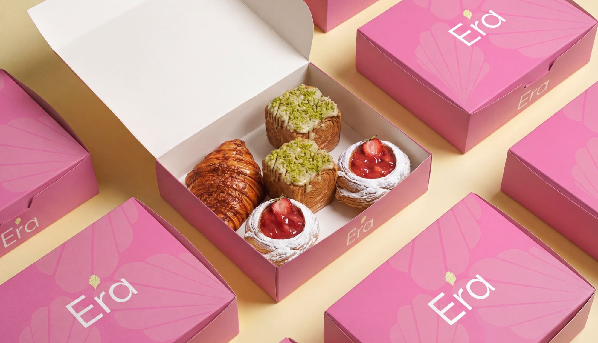
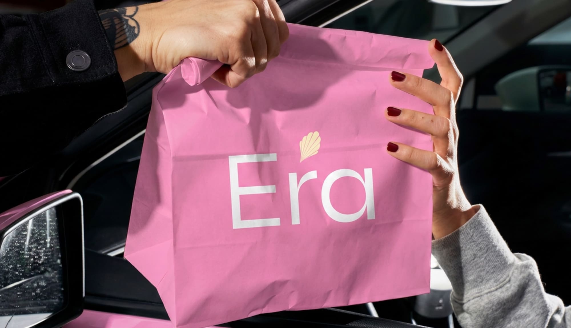
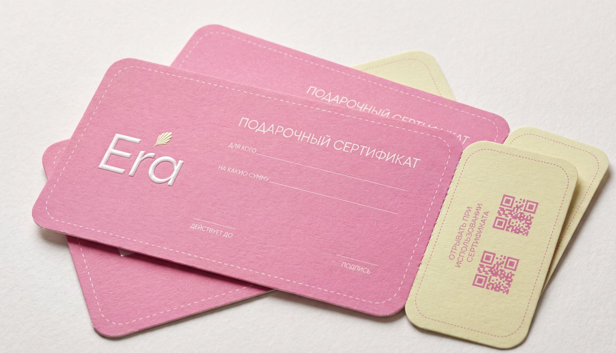
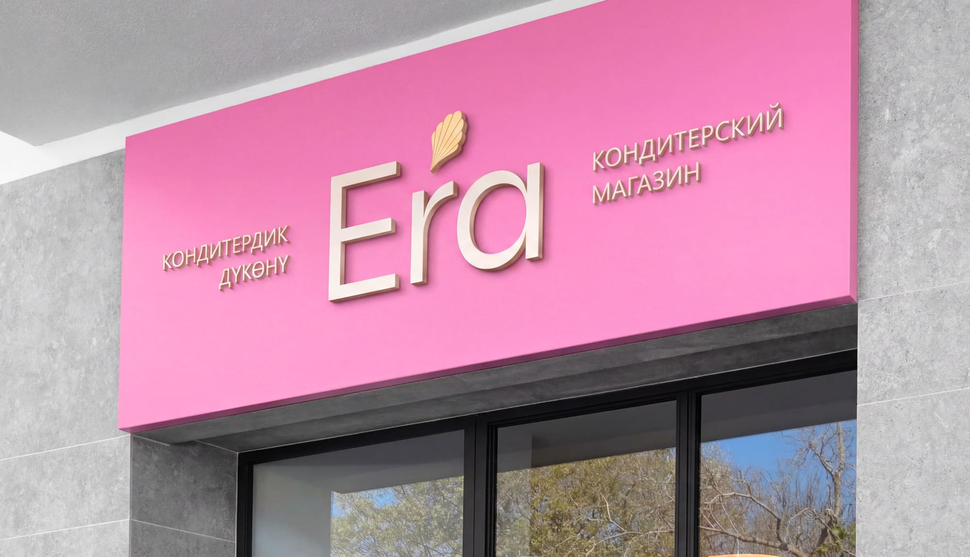
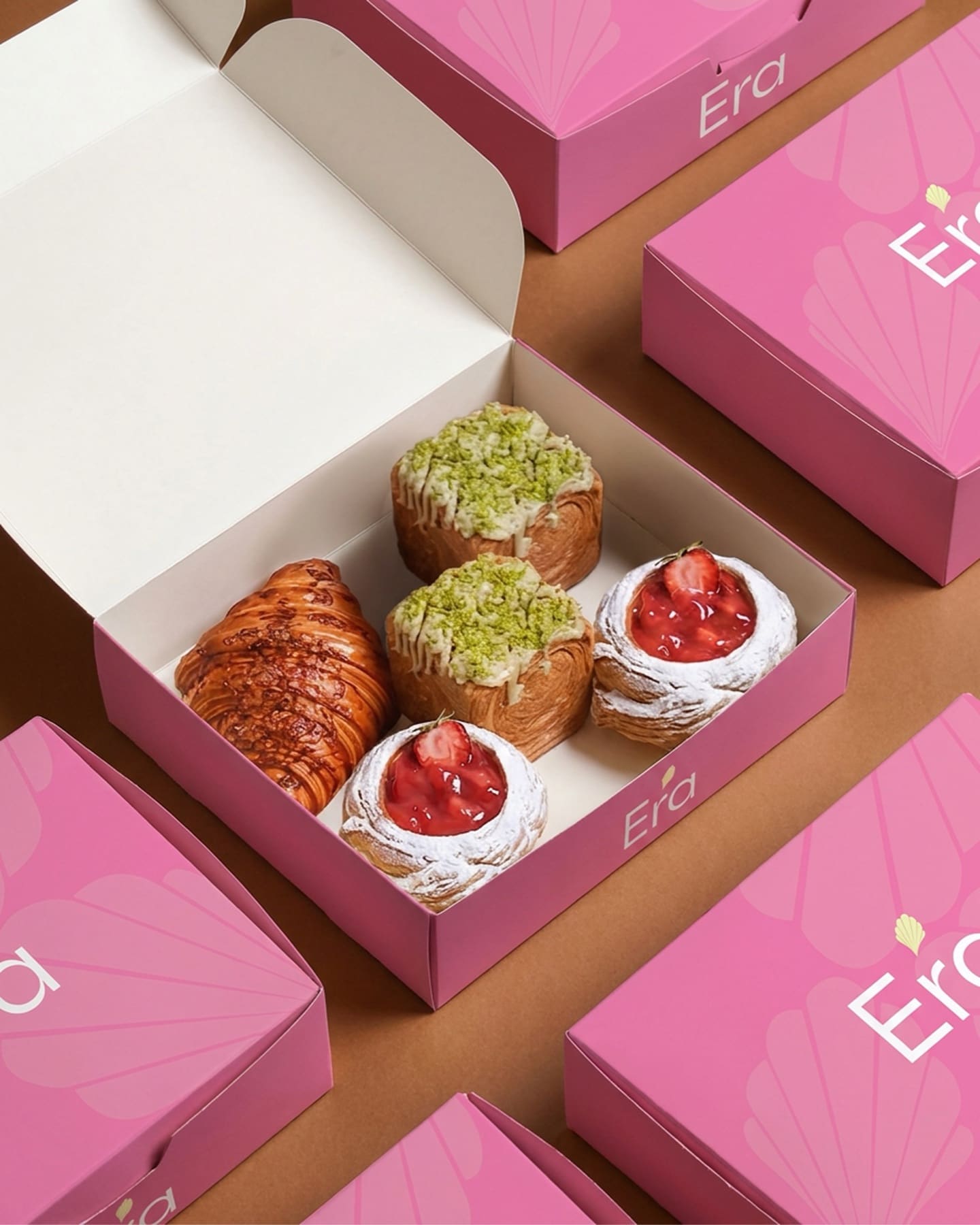
Pastry boxes
01
Logo
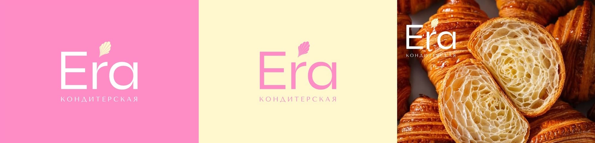
At the client’s request, we designed a minimalist logo free of unnecessary detail, reflecting the brand’s focus on modern confectionery. The main goal was a clean, light and memorable image that works on packaging, in social media and everywhere else.
The logo combines a concise type composition with a delicate symbol. The graphic element is shaped like a madeleine and also reads as an accent mark over the name Era. This gives the logo individuality and links it directly to confectionery.
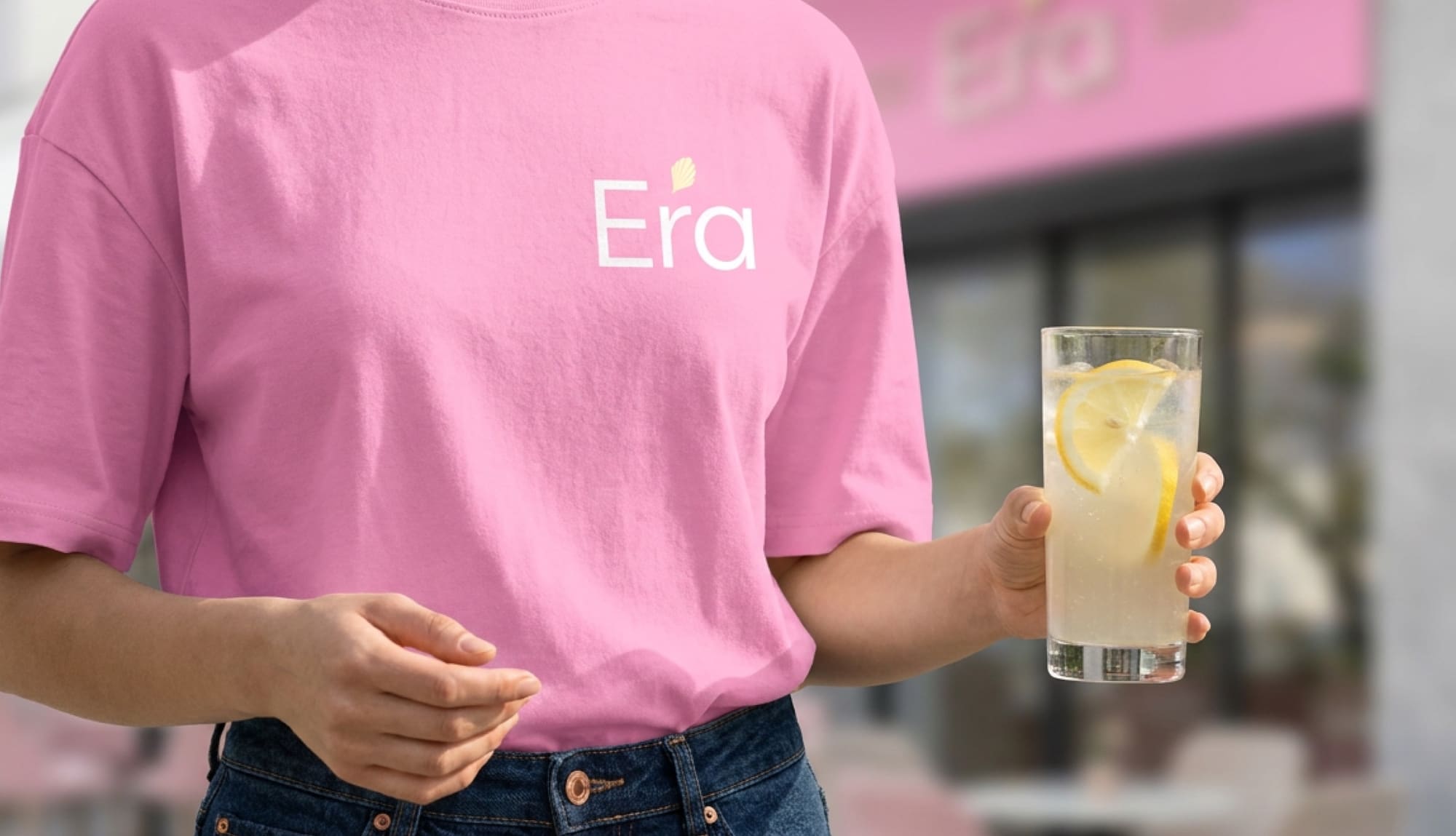
The typeface is a minimalist sans serif with a soft, modern character. Pink, the client’s choice of main color, conveys tenderness, aesthetics and an association with desserts. The result is an airy, modern and recognizable logo.
Symbol — a standalone element for packaging, patterns, icons, stickers and decorative details.
02 · Colors
#FB7DB6
RGB 251 125 182 · CMYK 0 65 0 0
#F0F1B8
RGB 240 241 184 · CMYK 7 0 35 0
#FFFFFF
RGB 255 255 255 · CMYK 0 0 0 0
03
Typography
Grafita — the logo typeface: expressive, elegant and refined. Its shapes suit confectionery and convey lightness, aesthetics and a handmade feel.
Tenor Sans — for supporting text: clean, highly legible and soft. It complements the logo on packaging, in social media and in print.
Tenor Sans
ABCDEFGHIJKLMNOPQRSTUVWXYZ
abcdefghijklmnopqrstuvwxyz
0123456789
04
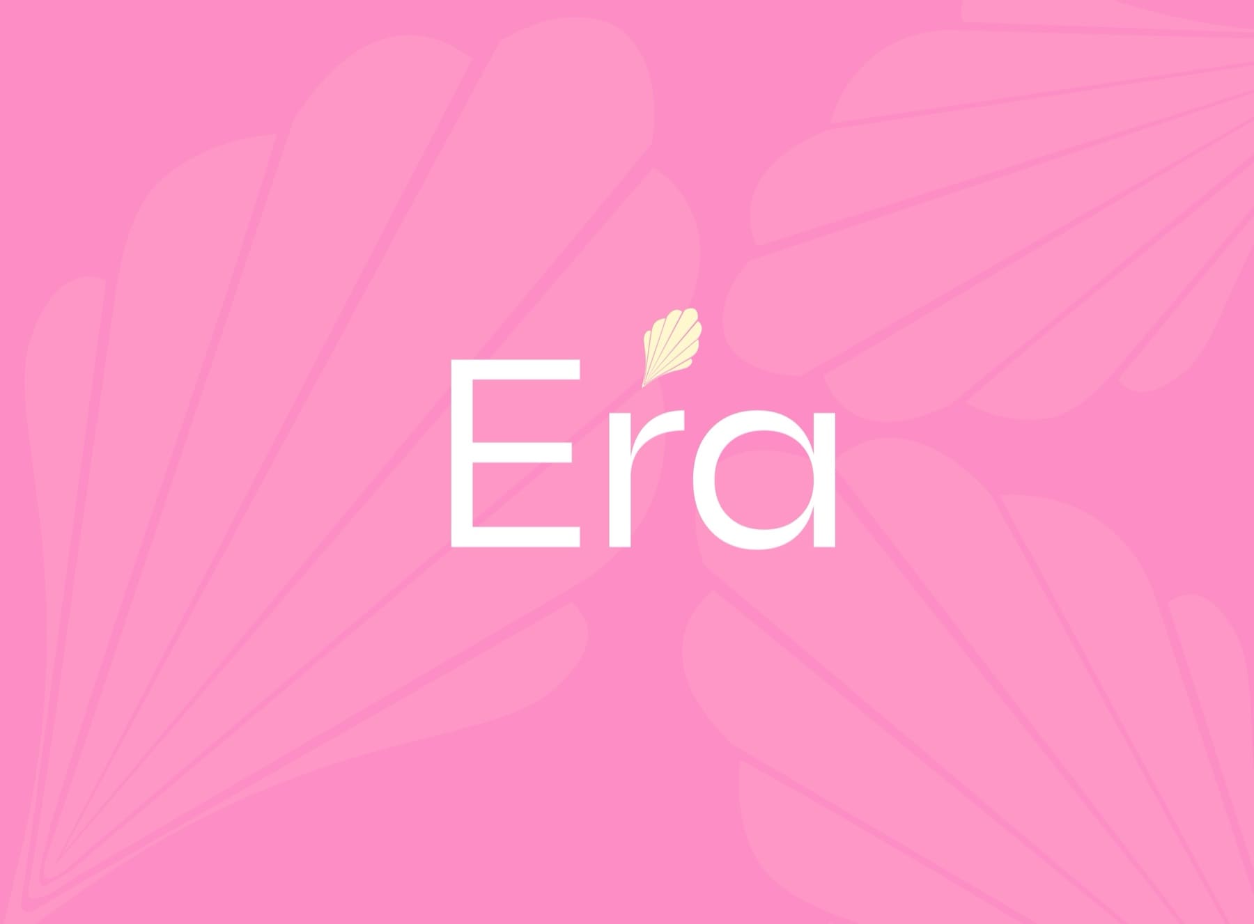
Pattern
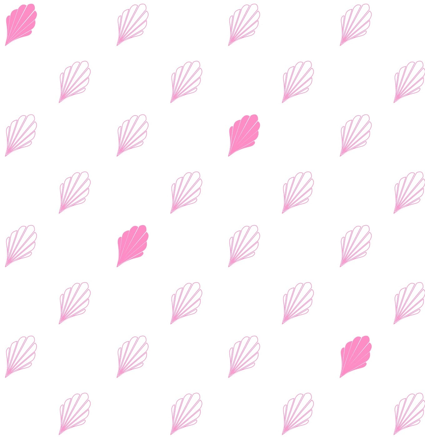
The madeleine symbol becomes a pattern — for wrapping paper, boxes and the small details of the brand.