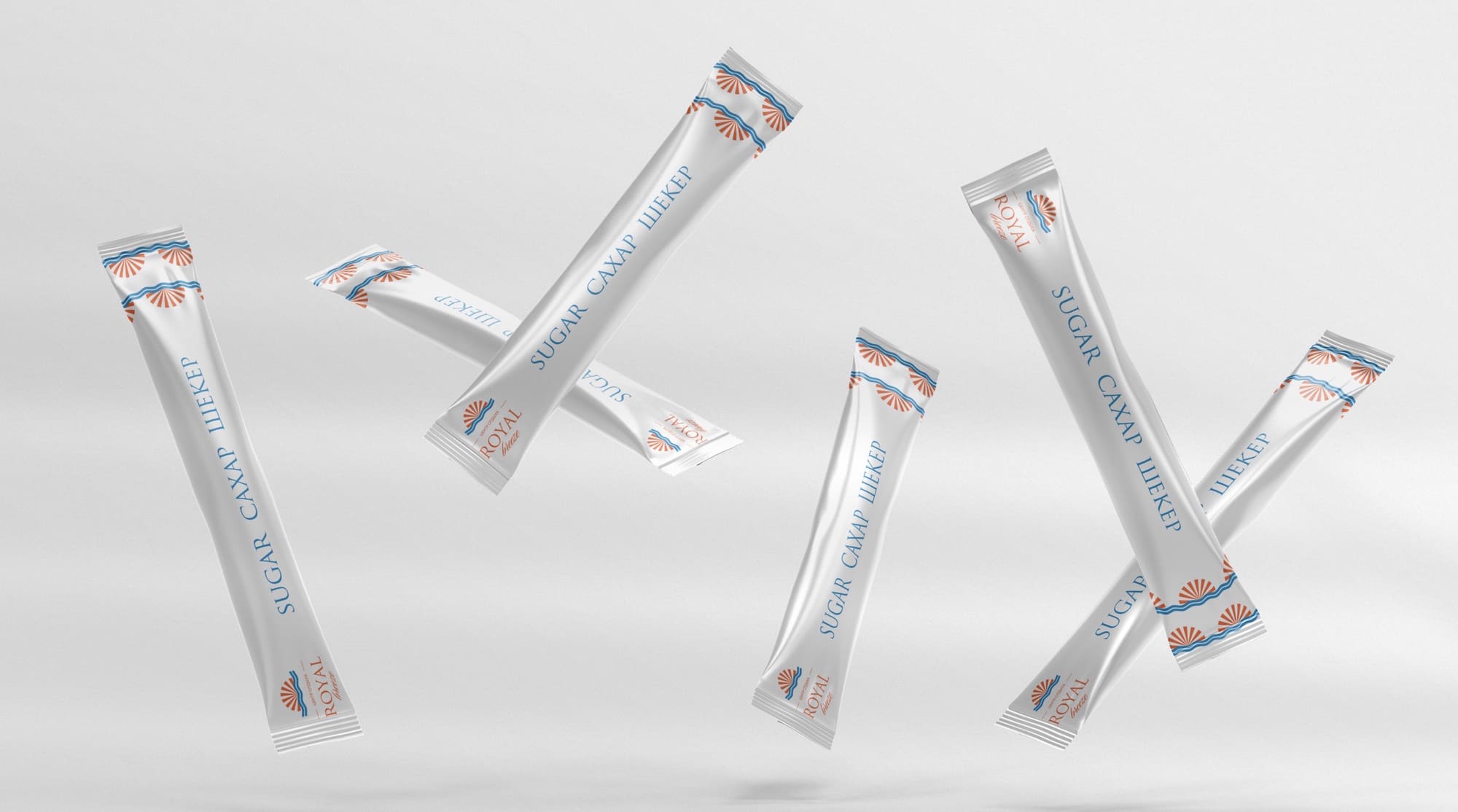
- Brandbook
- Recreation center
- Rebranding
- 2025
Royal Breeze
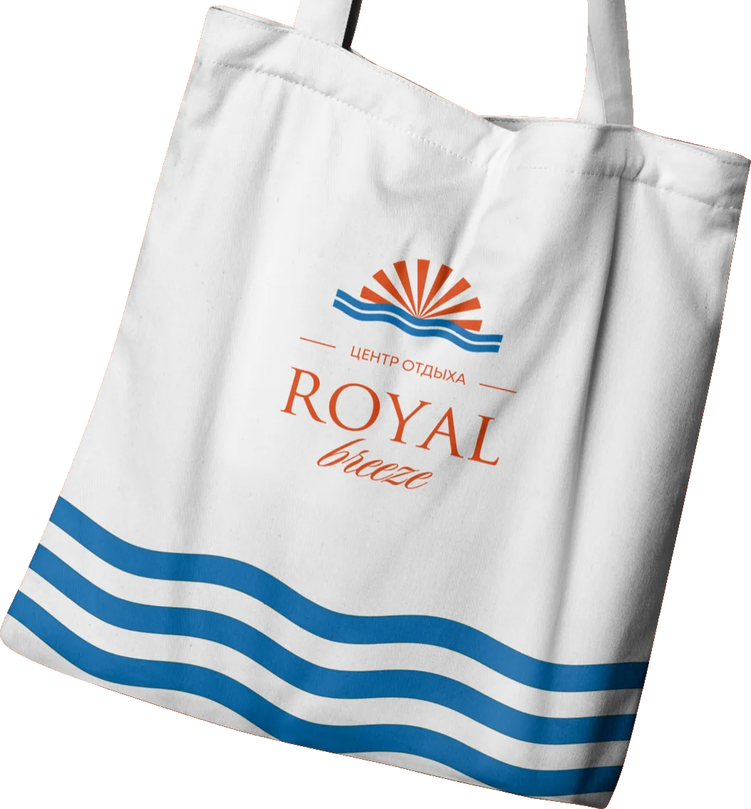
Recreation center · Rebranding A soft rebrand of a recreation center: from Royal Fish to Royal Breeze.
01 — The task
Royal Fish Breeze
Royal Fish came to us to refresh its visual identity and the way the company is perceived in the market. Over the years the name had become well known, but the brand’s image needed a modern rethink.
After analyzing the brand, we proposed a soft rebrand. For continuity we kept the key word Royal and replaced “Fish” with Breeze — a more versatile, lighter-sounding word that conveys freshness, ease and forward movement.
That is how the new brand was born: Royal Breeze, combining the recognition of the old name with a renewed meaning and a modern character.
02 — Logo
Pool +Sun +Wave
The Royal Breeze logo brings together natural symbolism and the aesthetics of premium positioning. Its visual accent is a pool-shaped form that sets a flowing geometry of comfort and structure.
Inside the form, a rising sun and a wave symbolize rest, renewal and a light breeze. Together they express the brand’s philosophy: relaxation, warmth and comfort in harmony with nature.
03 — Colors
The palette is built on the contrast of warm terracotta and deep blue, balancing energy and calm.
RGB 233, 78, 26
CMYK 0, 67, 89, 9
RGB 255, 255, 255
CMYK 0, 0, 0, 0
RGB 6, 116, 187
CMYK 97, 38, 0, 27
04 — Typography

Romul — for headings


NK828a — for subheadings


Riviera — accent typeface

05 — Pattern


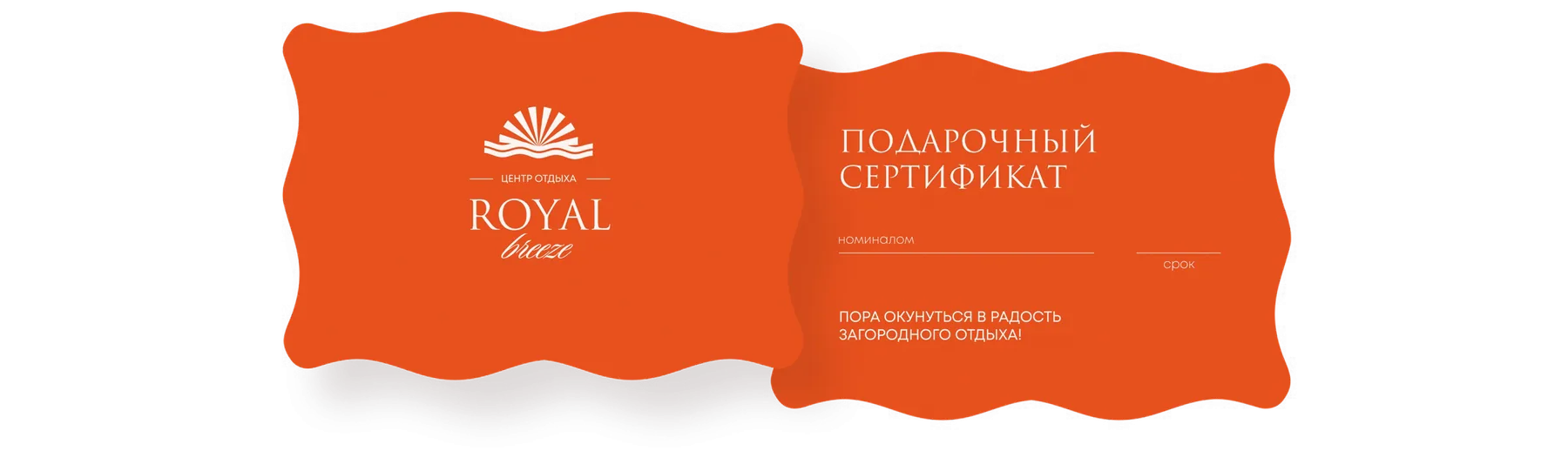
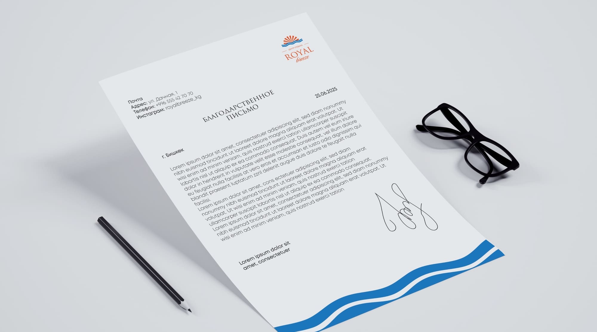
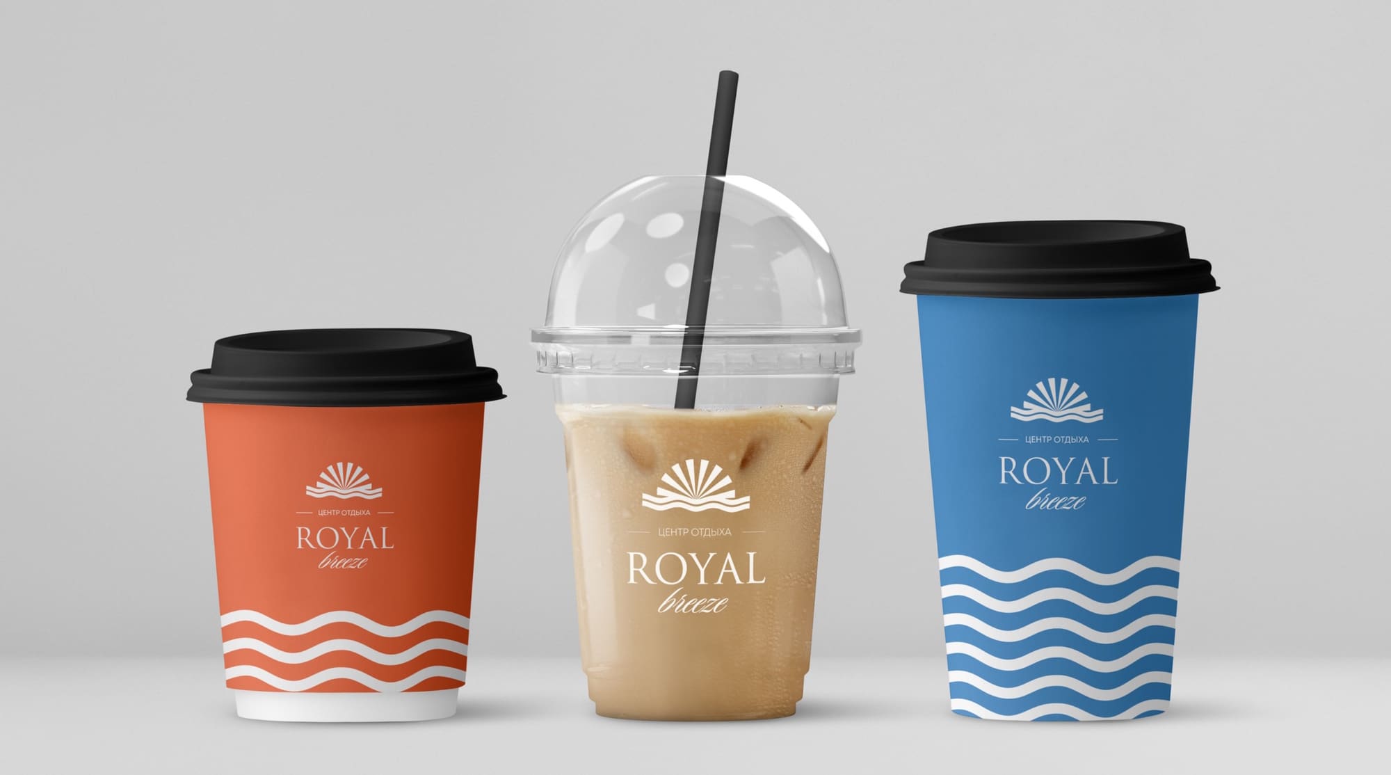
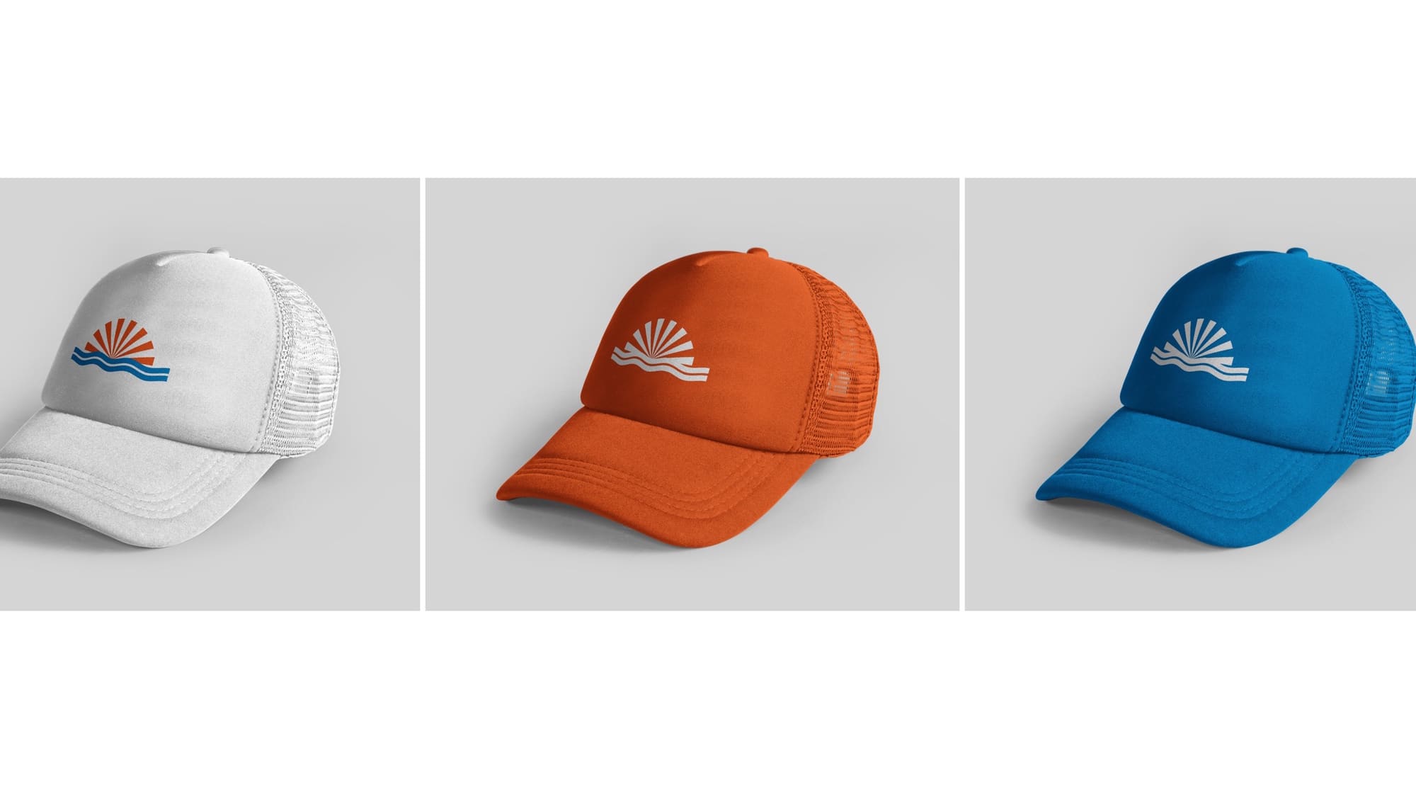
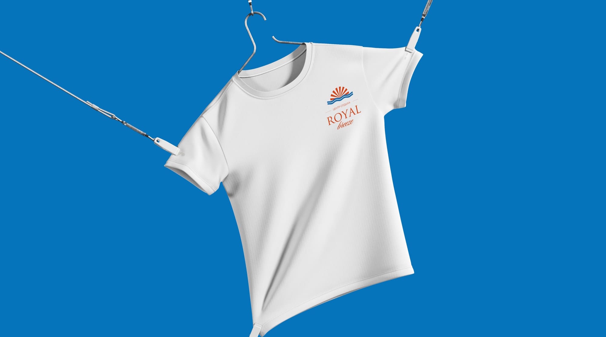
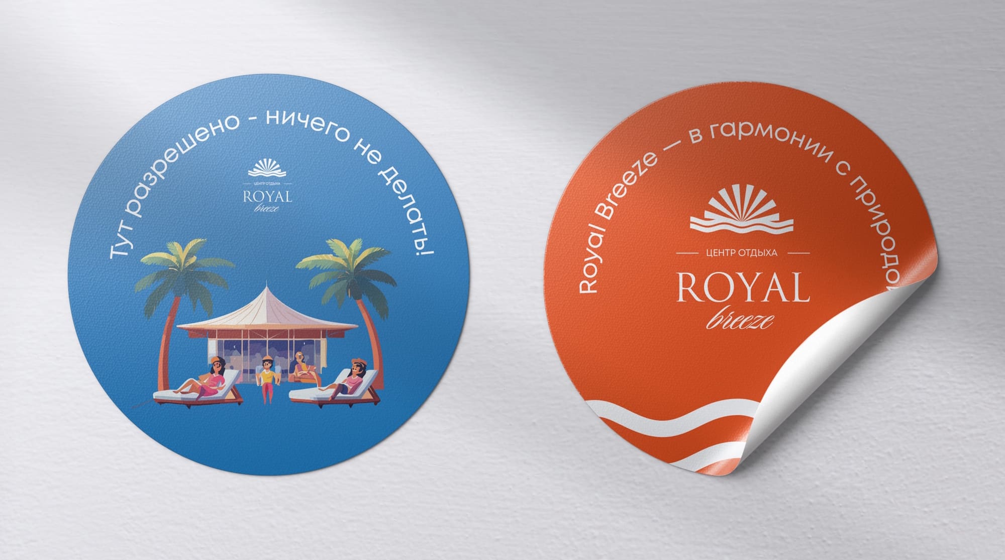
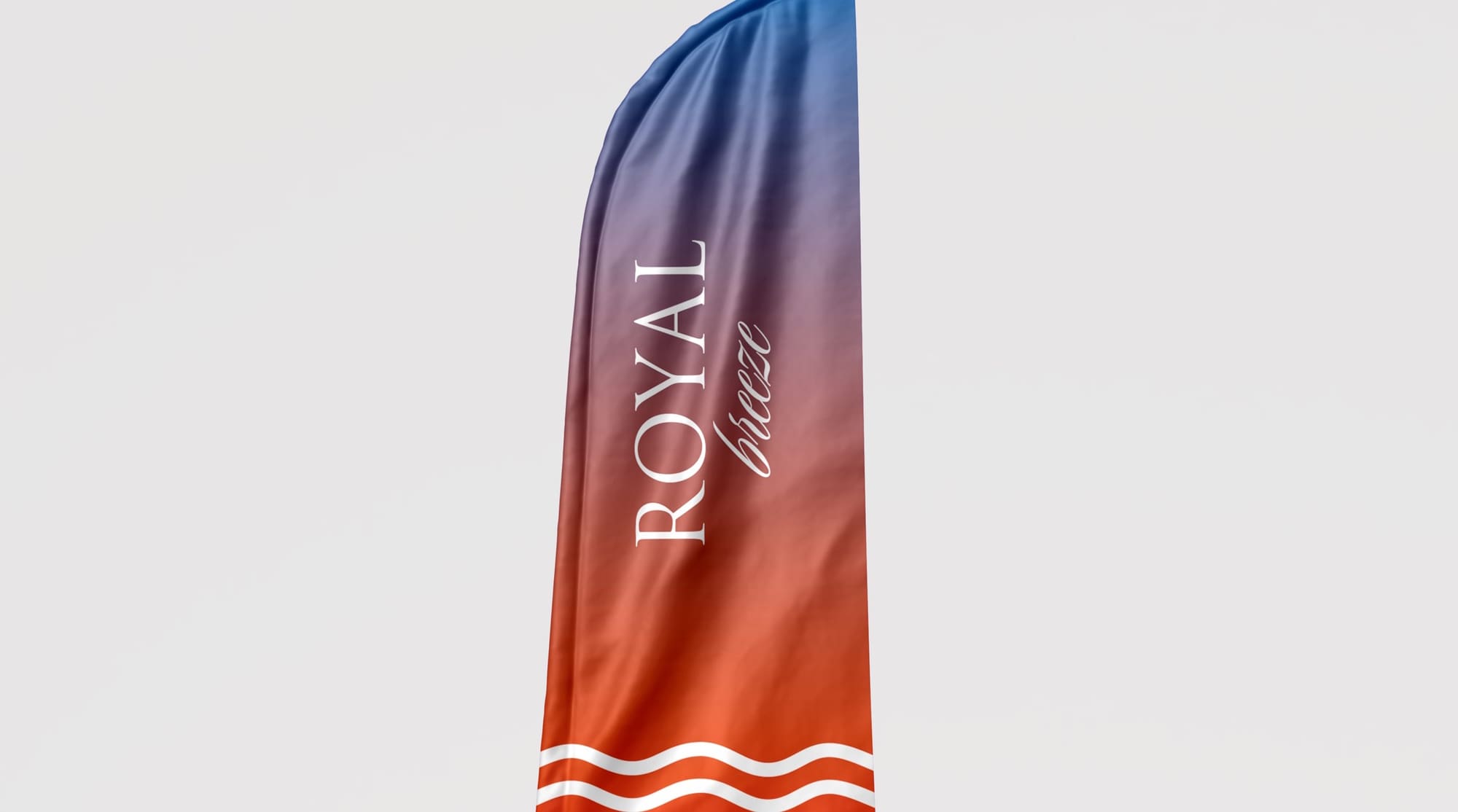
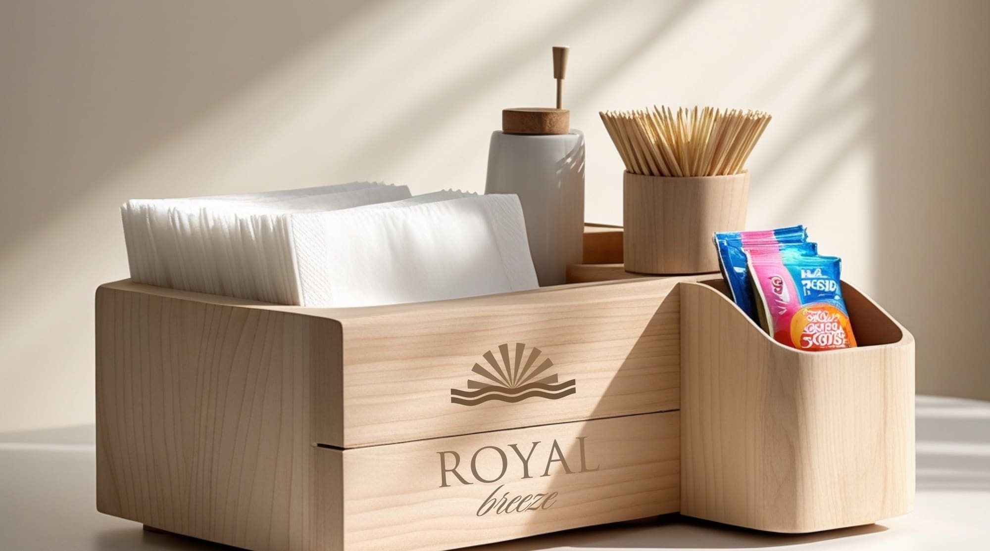
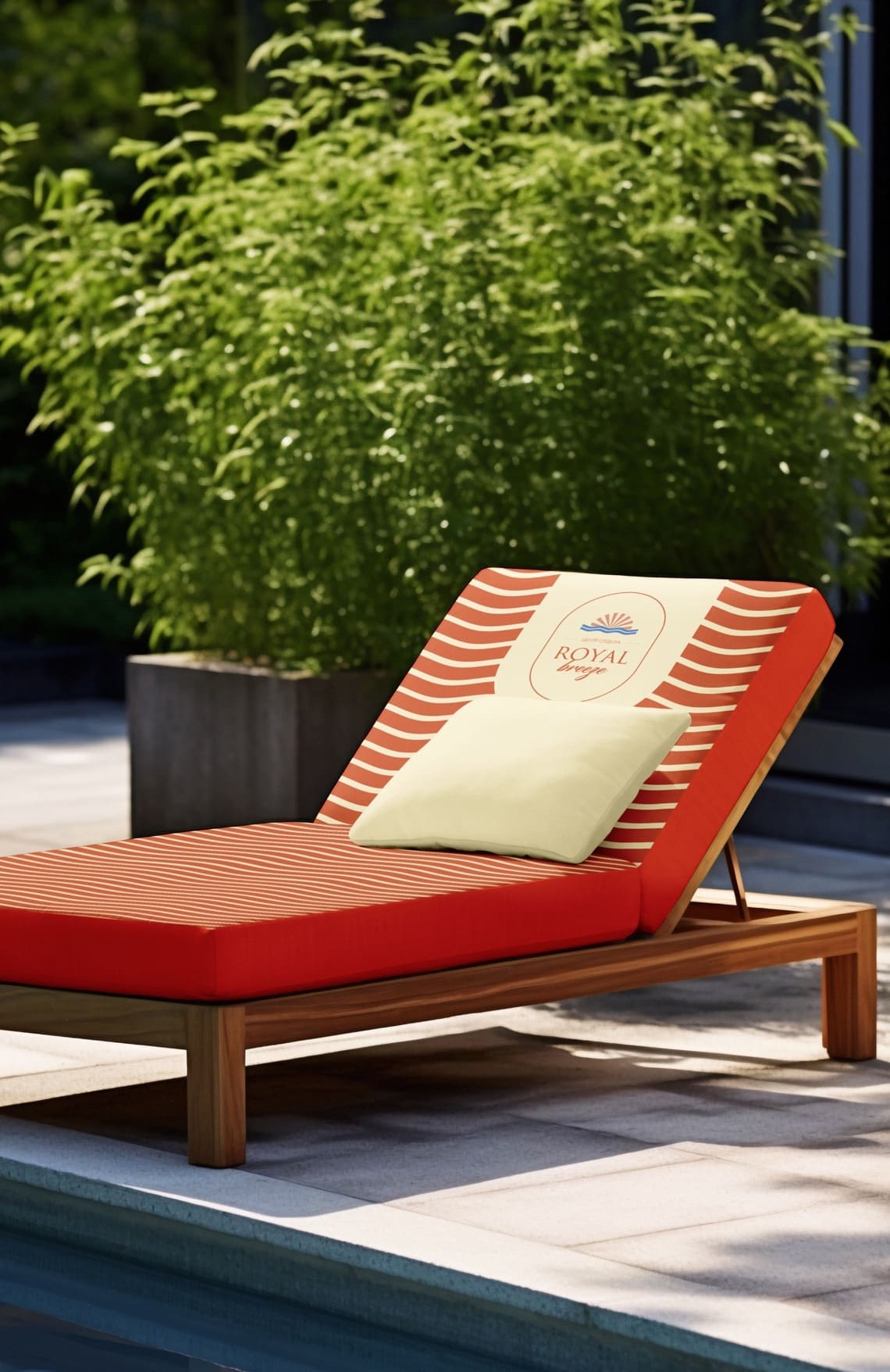
06 — Brand in use