Brandbook · 2025
The secret of place names

Social project · Brand identity
TAMGA is a project dedicated to preserving, studying and popularizing Kyrgyzstan’s place names.
“Jer-suu attarynyn syry” — the secret of place names

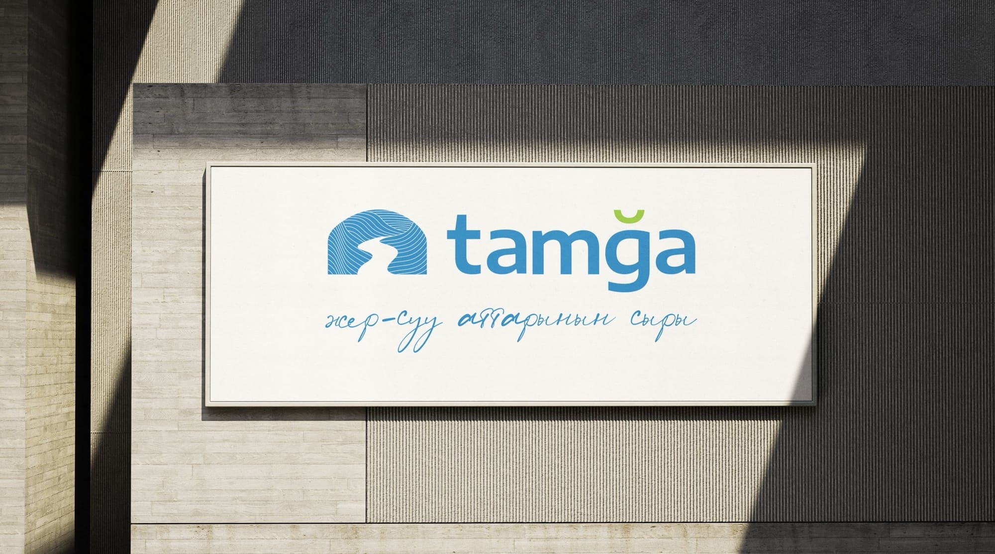
Logo
01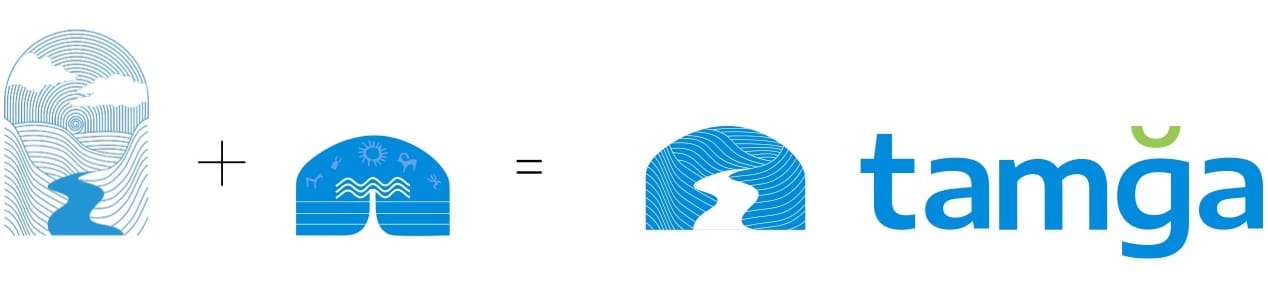
- 01 Yurt The sign is based on a stylized yurt — a traditional nomadic symbol of comfort and home. The yurt is a metaphor for protecting cultural heritage and caring for the history of the land.
- 02 Stream Inside the yurt’s silhouette runs a winding stream — a direct reference to one meaning of the word “tamga”: “a small stream.” It stands for the bond between generations, the flow of knowledge and a living thread between past and future.
- 03 Relief Relief lines inside the yurt recall the contours of a topographic map. They highlight the project’s geographic focus and reflect Kyrgyzstan’s diverse, unique mountain landscape.
Together, the yurt, the stream and the relief lines form a single sign where tradition, nature and science meet. It presents place names as “places with a story” and highlights their value for the nation’s cultural memory.
Colors
02RGB 0, 140, 220
CMYK 100, 36, 0, 14
RGB 255, 255, 255
CMYK 0, 0, 0, 0
RGB 151, 203, 77
CMYK 26, 0, 62, 20
Typography
03Encode Sans Expanded — for headings
ABCDEFGHIJKLMNOPQRSTUVWXYZ
abcdefghijklmnopqrstuvwxyz
0123456789

Betmo — for the slogan, accent typeface

Pattern
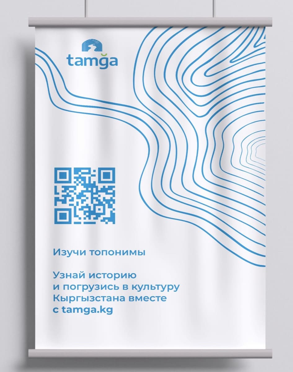
04The pattern repeats the contour lines of a topographic map — the same relief that lives inside the logo.

Social media
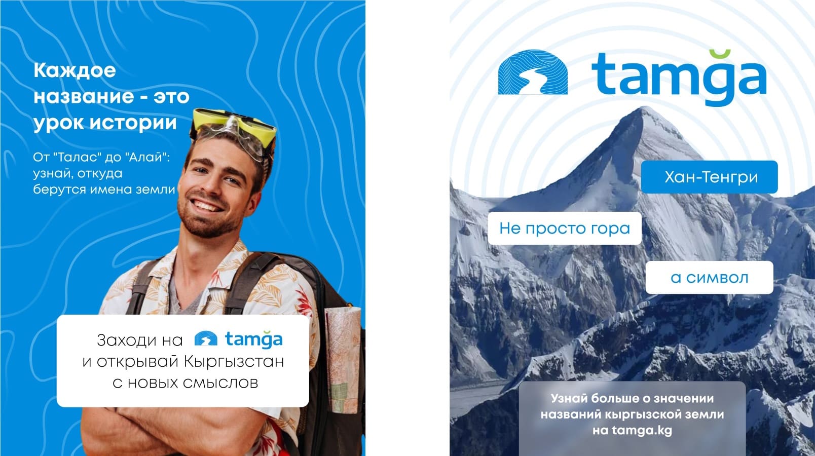
05Profile pictures and Stories highlight covers built from the logo, the pattern, the mountains and the stream.


Brand in use
06